NOTES:
three types of lighting - key light , fill light, hair light . you can choose to have them all on or just one/two of them on
hair light is very hot, it seperates the subject from the background - makes edges of your body pop. draws attention to the face and makes you stand out
with just key light on, left side of face is in the dark, dramatic look
when fill light is on with key light, shadows are less dramatic. fill light is about twice as far away from subject as key light
less intense light - push light further away.
hair light makes it look loike theyre in a film
hair light can be elevated with a boom arm . can give camera a flare if pointed direcrtly at it.
with just hair light on and no others, quite scary look/dreamy look
Wednesday, 7 March 2018
Tuesday, 6 February 2018
Storyboard of images
- Using DTP (Publisher) and an image manipulation programme, product the first draft posters. If you are yet to take any images, you will have to make them using place-holder found images.
- Look at another student's blog and leave some feedback (constructive peer assessment with WWW and EBI) as a comment.
the images outlined in red are the ones that i have chosen to use for my posters. i chose that particular image of Katie because she looks happy and is smiling towards the camera. this creates the idea that she is happy and comfortable in the clothing that i am selling to the audience. i like how she looks relaxed in the pose that she is in. with her arms above her head, the audience can see more of the jumper she is wearing which draws more attention to it. her body is very stretched out to create the impression that she is showing off the clothes on her body. the group photo of the girls that i chose is my favourite because they all look happy and satisfied in their clothing. it is noticeable that all the girls are facing in different directions which links well with the different positions that they are in. this promotes variety and difference which is a key part of fair trade.

Friday, 2 February 2018
Statement of Intent
- Media Language (conventions of the products)
- Media Audience (Target Audience)
- Media Representation (How the message is constructed about groups of people and how the audience relate to these constructions)
- Media Industries (The companies behind the products, the legal considerations and how profit is generated by the products. Considerations relating to cross-media platforms and where products will appear as part of the campaign.).
1. How do you intend to use the four areas of the media theoretical framework to communicate meaning and meet the requirements of your chosen brief? (approx. 400 words)
I intend to use the remove background tool on the computer in order to put the image of my model infront of a tree/a field. This background image links well with the idea that the clothing is from a natural source. It also portrays the sense that the earth is beautiful and it should be taken care of. Other fairtrade campaigns include many images of the world therefore i decided that it would be sensible to include it on my posters.
I will be using a young teenage girl in the poster to reflect the young target audience. The target audience would see themselves in the product meaning that the product appeals to them. The demographics B, C1, C2 would be the most suitable because these people tend to have decent pad jobs therefore they would be able to afford the clothing that is moderately priced due to the fair wages that are paid to the workers .
The posters that i will create would be seen primarily on social media because social media is an extremely powerful advertising tool. The plan is to get as much attention as possible onto the idea of fair trade clothing can be fashionable.
my role within the marketing campaign is ...
they will have the same colour brand name and font. they will both have a natural background, such as a field or a tree. the model will be wearing similar coloured clothing
- Product 1: Two Billboard Posters
- Product 2: Moving Image Advertisement
I intend to use the remove background tool on the computer in order to put the image of my model infront of a tree/a field. This background image links well with the idea that the clothing is from a natural source. It also portrays the sense that the earth is beautiful and it should be taken care of. Other fairtrade campaigns include many images of the world therefore i decided that it would be sensible to include it on my posters.
I will be using a young teenage girl in the poster to reflect the young target audience. The target audience would see themselves in the product meaning that the product appeals to them. The demographics B, C1, C2 would be the most suitable because these people tend to have decent pad jobs therefore they would be able to afford the clothing that is moderately priced due to the fair wages that are paid to the workers .
The posters that i will create would be seen primarily on social media because social media is an extremely powerful advertising tool. The plan is to get as much attention as possible onto the idea of fair trade clothing can be fashionable.
my role within the marketing campaign is ...
2. How will you link your posters to demonstrate your knowledge about digital convergence of your media production? (approx. 100 words)
they will have the same colour brand name and font. they will both have a natural background, such as a field or a tree. the model will be wearing similar coloured clothing
Wednesday, 31 January 2018

Tuesday, 30 January 2018
Fair Trade Research
by changing the way trade works, the farmers in developing countries can get better pay and better living conditions.
Fairtrade is unique. We work with businesses, consumers and campaigners. Farmers and workers have an equal say in everything we do. Empowerment is at the core of who we are.
We have a vision: a world in which all producers can enjoy secure and sustainable livelihoods, fulfil their potential and decide on their future.
Our mission is to connect disadvantaged producers and consumers, promote fairer trading conditions and empower producers to combat poverty, strengthen their position and take more control over their lives.
Fairtrade sets standards, certifies products and ingredients, works with companies’ own schemes, lobbies government, works directly with producers, drive awareness for the public.
Tell your customers about the impact that you and Fairtrade are having on the lives of your suppliers. We can help you find out how the suppliers you work with have benefited from their Fairtrade certification and tell that story in a compelling way.
- Connect with Fairtrade’s UK supporters, including 118,000 Facebook and 98,000 Twitter followers. Keep them up to date with your business and its links to Fairtrade.
- Feature in our newsletter: Our campaigners love to support businesses working with Fairtrade. Our newsletter goes out quarterly to 29,000 of them and you can tell them about your work with the Foundation, national and local events and campaigns and new products you are releasing or stocking


Monday, 22 January 2018
Pre-production planning - mock up logo and posters
INFO
Task: produce a campaign of two '6-sheet' billboard posters to promote a new clothing range from Fair Trade Fashion, an existing agency client.
Brief: Fair Trade Fashion’s clothing ranges are ethically source and Fair Trade Fashion has specified that this must be a key part of the campaign in addition to ‘selling’ the clothes themselves.
Summary of brief requirements:- Statement of Intent (approx 350 words)
- Billboard posters: The client has insisted that each poster must have a different main image, with at least two different locations or at least two different mise-en-scene used across your posters.
- Location of posters: Content must be suitable for public transport locations (bus stops, underground stations etc.).
- Client target audience: 16-25 AB demographic.
- Two A4 size posters in portrait layout.
Marks are awarded for editing the posters (including photos, text, graphics, typography and layout).
The best projects will have characters demonstrating different aspects of the clothing range (different costume).
If you use the same location then mise-en-scene or lighting must be varied.
Strong work will represent different social groups and carefully consider where the adverts will be displayed in public places to target the right people.
Fair Trade Fashion is all about the ethics of clothes manufacturing and waste.
Protecting cotton farmers, producers, garment workers and artisans in the developing world from exploitation via working practises and pricing from large companies.
Reducing the environmental impact of manufacturing and waste caused by fast fashion.
Raising consumer awareness to help them make ethically sound buying choices.
PLANNING
 This is the logo that I have designed for 'Fair trade clothing'. I will use this on my poster to show the audience that the material used for the clothes is part of Fairtrade. I designed it so that the F and T merge into each other and the C protects them on the outside. This conveys the idea that by working together, we can protect others.
 From the initial drawing shown above, I have created the logo on the computer so that it looks more professional and effective when put in the corner of the poster.
This is another possible logo for the brand.


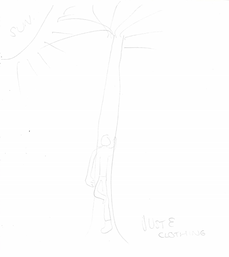
The image on the left is a mock-up of how I want my first poster to look. I will get my model to wear summery, pretty clothing and edit the picture of them onto a field background. In the corner I have included the Fairtrade clothing logo to show that the clothing that the model is wearing is Fairtrade. The model looks happy which suggests to the audience that the brand has a positive effect on people.
this is the other poster that i have created as an idea for

Thursday, 18 January 2018
New tabloid Guardian newspaper (left wing)
“a modern print format for a new generation of readers” and the “best of both worlds”, combining “the portability of a tabloid with the sensibility of a broadsheet”.
No longer are redesigns about selling more copies. They are about saving money.
newspaper is no longer as distinctive as it was when it was the only Berliner in town.
The Guardian, which made a loss of £45 million (€51 million) in the year to last April, is drawing a thick line under its 2005 investment and perhaps moving closer to the finish line of its history as a print product.
It may not be part of its current plans, but it would hardly be a shock were it to follow the London Independent out of the print market, stopping the presses completely and existing only online.
The shift to a tabloid print size is part of several moves, from cutting around 300 jobs to selling a stake in a trade publication group
The Guardian’s style of journalism will not change, but the new format allows it to be printed by a wider array of presses, helping it cut costs
“It’s very neat, very gray, and rather kind of middle-aged,” Mr. Hillman said. “Visually, this is a step backward.”
Subscribe to:
Posts (Atom)
-
Explain the impact of digitally convergent media platforms on video game production, distribution and consumption. Refer to Minecraft to su...
-
Explain why popular music radio programmes struggle to gain recognition as Public Service Broadcasting. Refer to The BBC Radio 1 Breakfas...
