Evaluate the success of your first draft product and your own production process by completing these evaluation tasks:
You need to complete an in-depth analysis of your final video by comparing at least four of your shots alongside the original you were trying to recreate.
The following areas of Media Language should be used in your analysis: Camera Shot / Angle, Location, Editing, Sound, Mise en scene, Lighting.

 |
| wear a hat indoors |
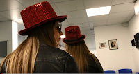
i believe the shot we used is quite similar to the one used in the professional photograph as it is a close-up of the actors but with the background of the cafe shown. however, the positioning of the actors isnt quite the same as in the professional shot - our actors should've been more to the right and the camera shouldve been abit further away from them. the angle of the shot that we used is effective because it resembles the one used in the professional shot. the camera is on a slight low angle. i believe we used a suitable location for this shot as it is a cafeteria like in the professional shot. however, the location used in the h&m advert looks quite dark and it isnt lit by many lights whereas the cafeteria that we used is very well lit and has a bright white interior. the costumes that we used in our shot greatly resembles the costume and props used in the professional shot as we managed to use a red hat, sunglasses and leather jackets.
 |
| short skirt after 40 |
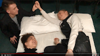
i am happy with the shot that we used as we managed to use a high-angle shot which got everyone in it. however, the shot wouldve looked more effective if the camera wasnt directly over the actors, it needed to be more from the left side of the bed. i am very satisfied with the location of this shot because it is not noticeable that the shot wasnt taken in a bedroom - it was taken in an IT room! i believe the dark area surrounding the bed resembles the professional shot very well and the white bed that we created looks exactly the same as the one used in the h&m shot. i believe the lighting that we used was suitable as the bed area is bright compared to the background. however, to improve it slightly we could've made rob's face darker to make him look like he is more in the background. our use of props couldve been improved if we brought a black embellished dress for hannah to wear. instead, we tried to recreate the dress by wrapping a leather jacket around hannah's waist.
 |
| Wear a short skirt if you're a man |
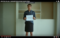
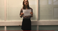
the camera shot and angle that we used here was very similar to the one created by h&m. we made sure that we used a medium close-up of our actor and that the camera was facing straight on towards the actor. i would say the lightning that we used could've been improved because there are shadows over zach's body whereas in the professional shot there is clear bright lighting in the shot. i am happy about the location we used for the shot because there are lines in the background of our shot aswell as the professional one. we used appropriate props for this shot because we made zach wear a checked shirt and a skirt. we also recreated the sheet of paper that the actor is holding by writing the words in a blue pen.
 |
| dont try at all |
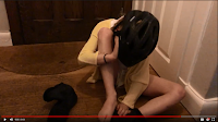
this shot has been recreated well in my opinion. the location is perfect as we have took it by a brown door, on a wooden floor with the rest of the background the colour white. the boy that we used resembles the actor used in the professional shot as they are of a similar age and are in the same body position. we used very similar props to recreate this shot, such as the yellow dressing gown, the blue shoes and the black bicycle helmet. the only element that we could've improved is the lighting. we could've done this by taking the shot in daylight rather than in artificial light. this would limit the amount of shadows that appear around the door. daylight would also illuminate the colour of the shoes which is hard to see and would make the white background more crisp and clear.
 |
| dress like a man |

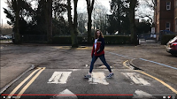
i am happy with the shot we used for the 'dress like a man' shot because the location looks realistic. The actor we used is crossing over a road and there are trees and a building in the background which is the same as in the professional shot. an improvement that we could've made would be to use a more professional camera that allows us to focus on the actor and blur out the background. this would focus the audience's attention on the action rather than what's happening in the background. also, if we used a handheld camera to create a shaky effect and followed the actor walking it would resemble the professional shot more. we made sure that we used a long shot. for this shot we could've edited it so that the camera has a shaky effect, like in the professional shot. the costume that we used for this shot could've been improved as it would've been fairly easy for us to find a full black outfit but we used navy blue and red instead. however, we managed to use an actor with short hair and made her wear white socks like in the original advert.
 |
| stand out |
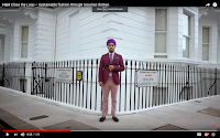
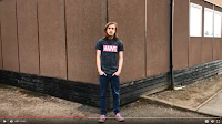
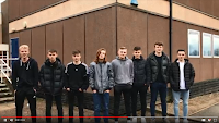
the location for this shot couldve been improved because it does not resemble the professional shot. however i am happy that we managed to create the shot on the corner of a building. in order to improve we couldve took the shot at a white house or building rather than at school. another improvement that couldve been made would be the outfit that the actor is wearing. i believe we could've found some pink clothes for zach to wear to resemble the outfit that the man is wearing in the professional shot. also, the pose that zach is doing does not resemble the one that is used in the h&m advert which couldve easily been replicated. despite the negative points, we successfully used a long shot here and made sure that zach was standing right in the middle of the shot.
 |
| blend in |

Task 2:
How organised were you as a group? What elements of organisation were vital to you as a production group?
i would say we havent been as organised as we could be in our group. however, we did manage to get alot of shots done as a group by going out and finding props and suitable outfits to recreate the shots.
What technologies did you use and how did they serve to develop your skills as a media practitioner?
for the majority of our shots we used an iPhone 7/8 camera because none of us had professional camera.
How creative do you think you were during this process? What elements of the project required creativity and imagination, even though you were given a very structured brief to 'copy'?
How successful do you think your first draft video is? Use examples from the film to illustrate your evaluations.
In preparation for the next stage of your production work, what knowledge of experience will you take with you into the next project?


No comments:
Post a Comment